 I have been working in a small team this week on setting up a framework for a large project. We had all of our toys out of the box and it was important to make sure that everything was correct. We had DOORS Next Generation, Team Concert, Quality Manager, Design Manager, and RELM, sitting in the background were the Lifecycle Query Engine, Jazz Reporting Service, Global Configurations and Lifecycle projects. In total there were around 30 Project Areas created across the different applications and in four separate lifecycle projects.
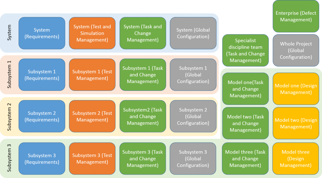
I first created a picture showing the project areas and how they fitted into the lifecycle projects. Just a simple PowerPoint slide with some coloured boxes. The important part here was to get the finalised names written down. You can see in the image below the general layout, although I have anonymised the names here.

Subsystem 3 is the one where we have most detail, including three separate model or simulation areas. This is for a LARGE system, and each project area represented on the image will have multiple people working on it, we are not advocating the creation of a project area for a single document, or even for a single person. I have not included any detail of the models that are linked through Design Manager, at least one was Rhapsody, but they could easily come from other specialist tools.
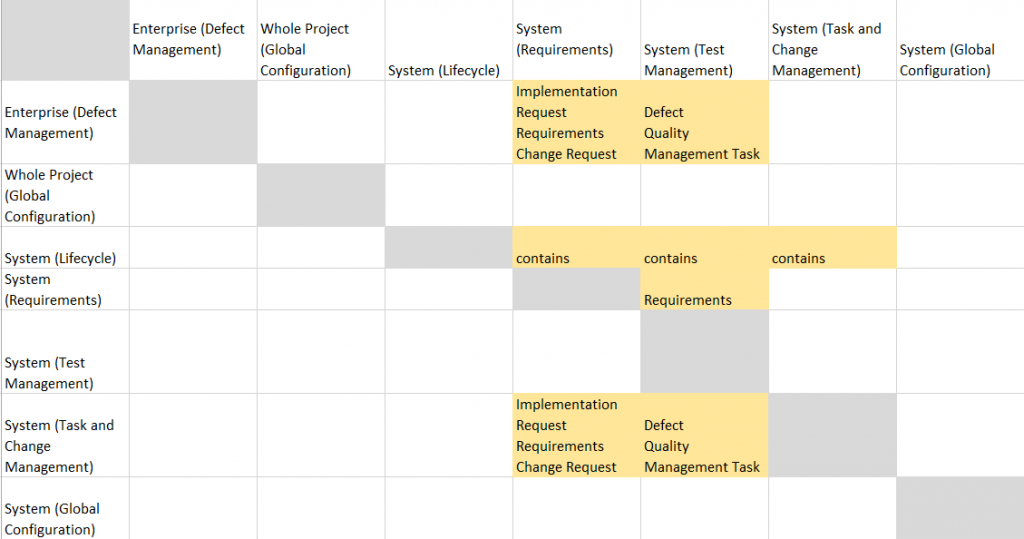
If you create a single lifecycle project then all the relationships are automatically made; applications provide and consume information in appropriate ways within the project. For this, we had something a little more complicated. I drew the relationships out, and we cross checked against the implementation. This is the top left corner of the chart, showing one lifecycle project.

Quality manager doesn’t provide any services, but does consume. The global configuration doesn’t provide or consume any services.
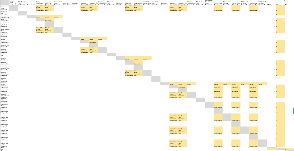
This pattern can be seen repeating over the large chart, although you can’t read the detail here.

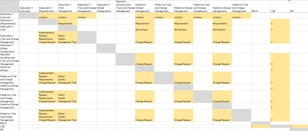
Finally, the more complicated Subsystem 3 project shown in a little more detail.

The busy columns here towards the right are the Design Manger project areas. The rightmost busy column is LQE which takes data from all project areas except the lifecycle project, and provides data to both RELM and the jazz Reporting Service.
To set up a single project, this type of diagram will not be necessary, but once there are multiple, connected projects, it is a useful exercise. Checking the chart takes two people, and is a brain-melting exercise. My colleague called out the project area name and then called out the services provided or consumed. The project area names are following a pattern and for such a simple checking exercise, a remarkable level of concentration is required. However, this did reveal a small number of mistakes in the set up and so was worthwhile. The presence of strong patterns in this diagram is also very helpful. A break in the pattern needs to be explained, it will sometimes be correct, but making it visible is the first step.
The structure required depends on the team organization and size, and on the formality required during development, among other things. Dashboards become very important when this scale of project is set up. Here we can create dashboards for individuals that show data from a single application project area, and we can show overview dashboards that pull data from multiple sources. The Global configurations ensure that the data is connected at the right versions across the different applications and projects.
Yes, it looks complicated, but if you put a few hundred people on designing a system, you will not have a simple picture. Large projects have always been this complicated, but we rarely see the big picture, and the big picture can be very valuable.
